Containers + Spacing
Intro text – Optional – Rorem ipsum dolor sit amet, consectetur adipiscing elit. Etiam eu turpis molestie, dictum est a, mattis tellus. Sed dignissim, metus nec fringilla accumsan, risus sem sollicitudin lacus, ut interdum tellus elit sed risus.
Container settings
Forem ipsum dolor sit amet, consectetur adipiscing elit. Nunc vulputate libero et velit interdum, ac aliquet odio mattis. Class aptent taciti sociosqu ad litora torquent per conubia nostra, per.
Width: Default (none)
Groups, stacks, grids, and columns can define a background color. Covers can define a background image.
By default the contents within these components will be contained within the site’s container (1320px on desktop by default).
Width: Wide
The wide settings applies a max-width of 2000px for the group background. Screens that are wider than 2000px will see the edge of the background, but any screen smaller than that will appear as if the block is the full screen width.
The contents within the block will still be contained within the site’s default container (unless overridden).
Width: Full
The background of a full-width group will extend the full width of your browser, even on extra large monitors.
Inner group widths
You can set an explicit width of a group in the right sidebar. Use these widths to maintain consistency while
880px
Set the width of your group to 880px to ensure that a line of paragraph text doesn’t extend too wide, as that makes it harder to read.
1100px
Use this width when the layout within the group feels stretched too wide or when the paragraph-size text within the layout would stretch wider than 880px.
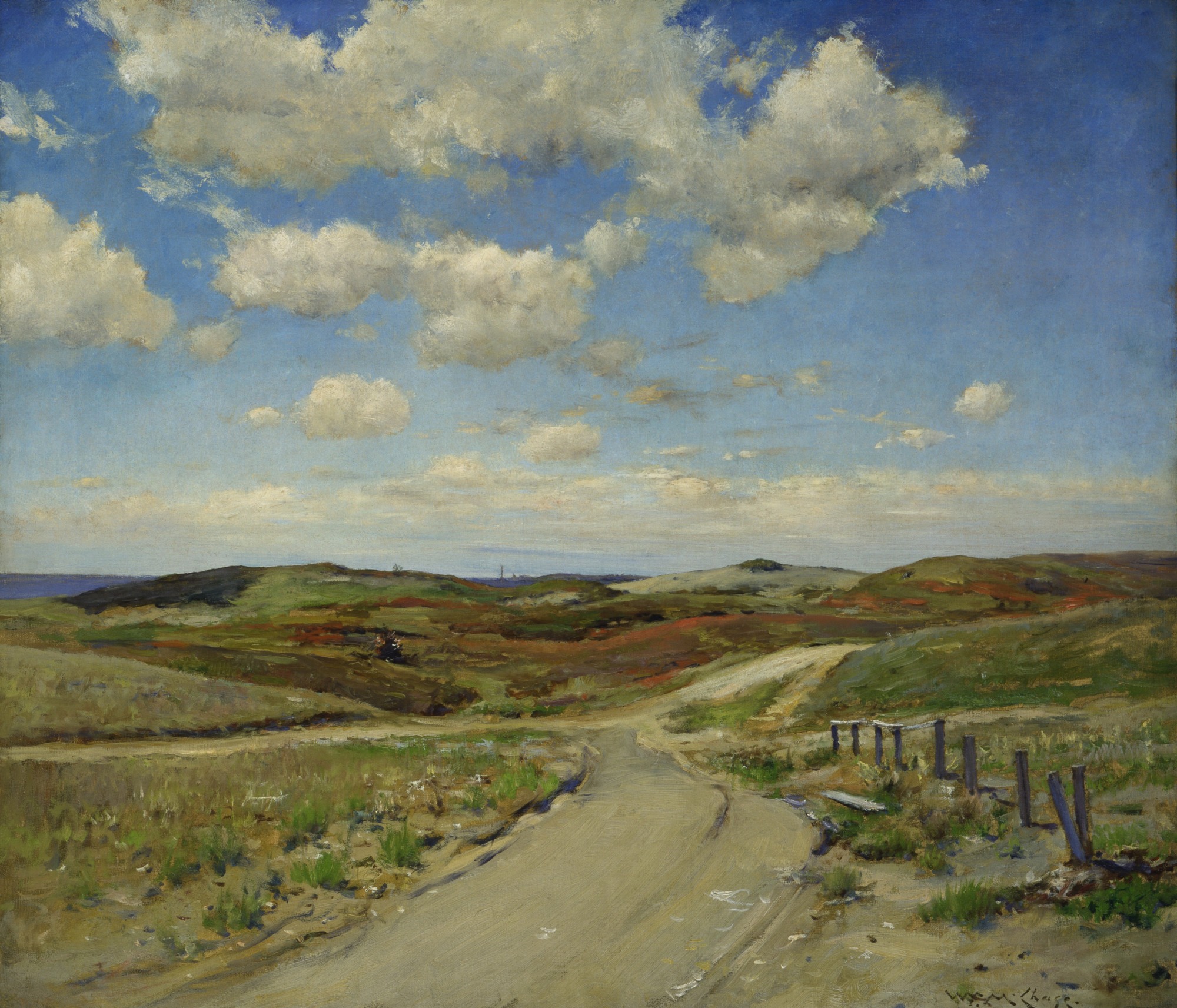
Cover element, full-width
Covers allow for background images and a color overlay to ensure the text is legible.
Spacing
Forem ipsum dolor sit amet, consectetur adipiscing elit. Nunc vulputate libero et velit interdum, ac aliquet odio mattis. Class aptent taciti sociosqu ad litora torquent per conubia nostra, per inceptos himenaeos. Curabitur tempus urna at turpis condimentum lobortis.
Spacing default: 24px
24px
24px
24px
24px
24px
Padding-lg: 1.5x of default
36px
36px
36px
36px
36px
Padding-xl: 2x of default
48px
48px
48px
48px
48px
Padding-xxl: 3x of default
72px
72px
72px
Padding-xxxl: 4x of default
96px
96px
96px
Padding-sm: 0.5x of default
12px
12px
12px
12px
12px
Padding-xs: 0.25x of default
6px
6px
6px
6px
6px
Padding-none: 0px
0px
0px
0px
0px
0px